Turn on
Here’s a job that turned out well and demonstrates the creative thought I like to bring to every job.
I was approached (by regular collaborator brand&content) to design a media pack for Radio One Mallorca – the only English language commercial radio station on the largest of the Balearic islands.
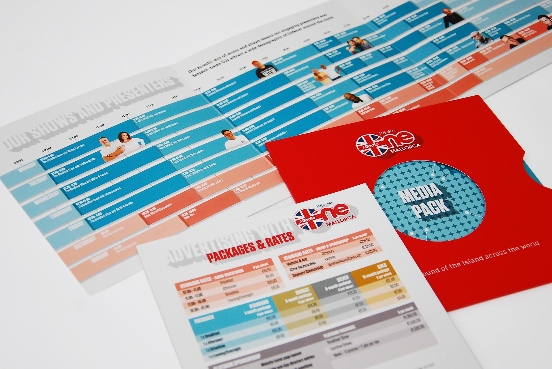
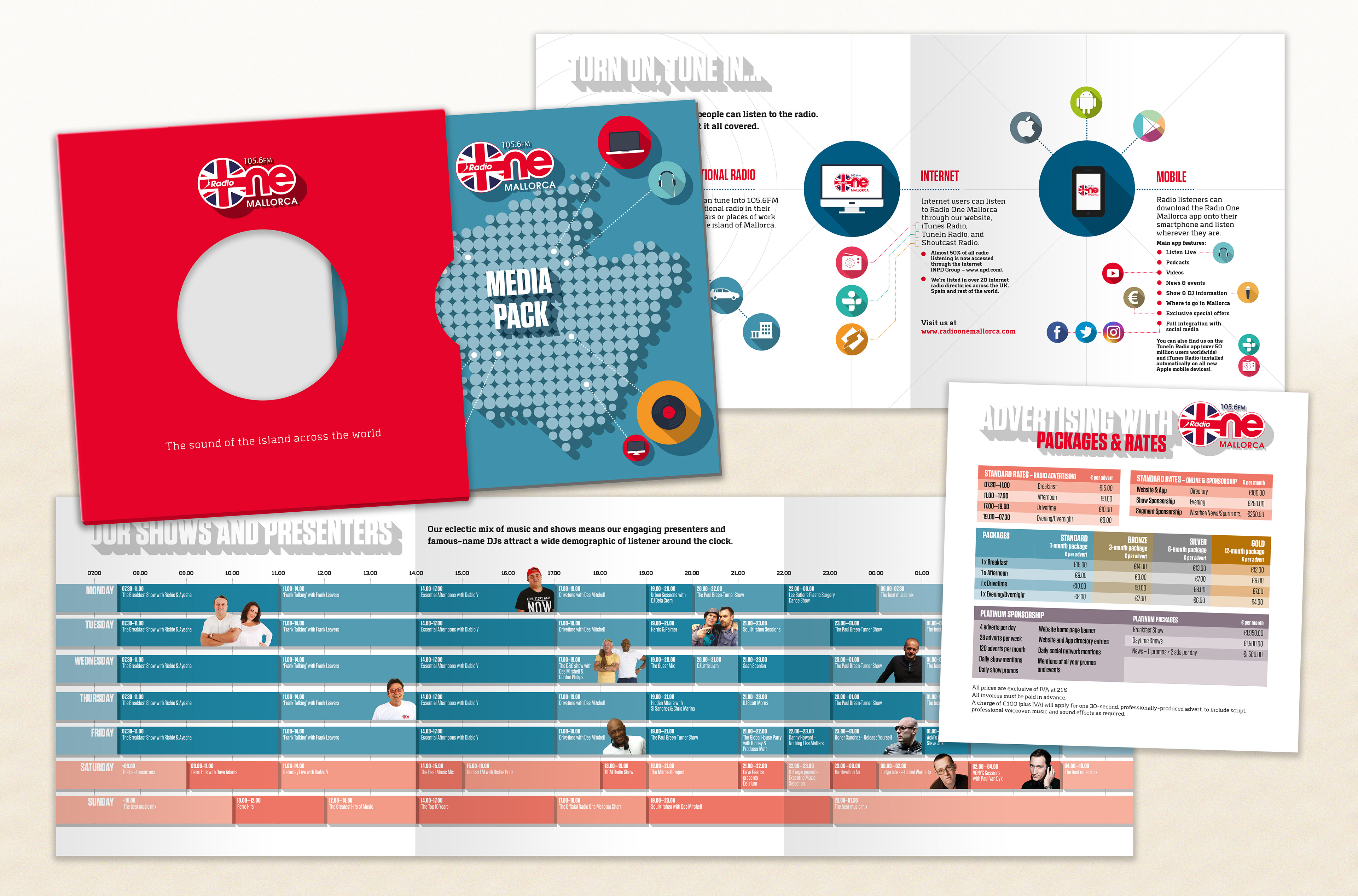
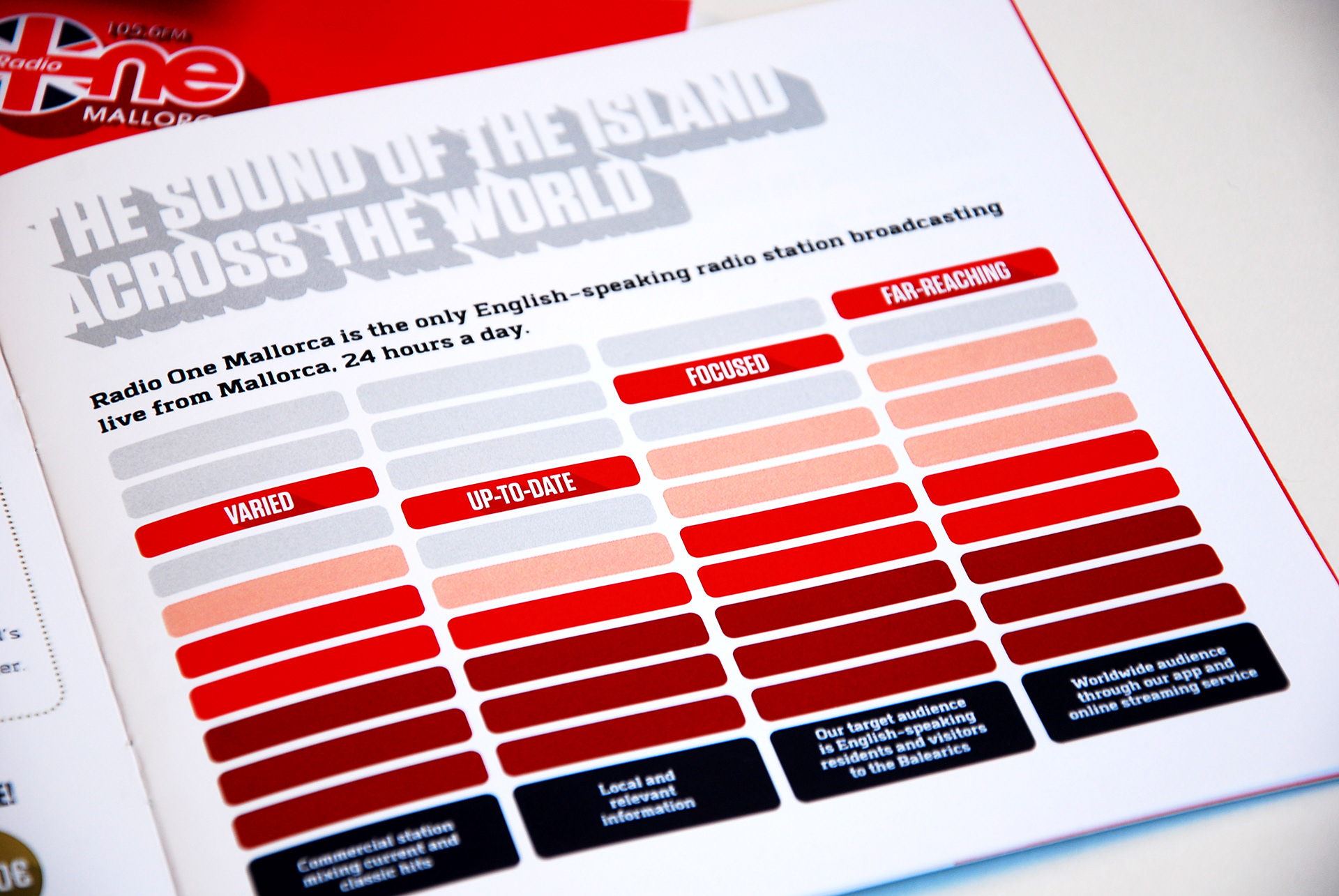
The pack needed to contain a brochure (outlining the station’s credentials, reach and explain its advertising strategy), a rate card (detailing its advertising packages) and a schedule of show times and presenter details.
Tune in
Because the brochure was reasonably substantial and latter two items were potentially subject to shorter-term changes, it made sense to create a number of separate items. This meant the client wouldn’t be committed to expensive reprints of a single publication should there be minor changes to scheduling or costs further down the line.
This would also give the finished item more presence as a ‘pack’ rather than just a single piece of collateral. But it meant that a sleeve or folder of some kind would be needed to keep the items together and form the pack.
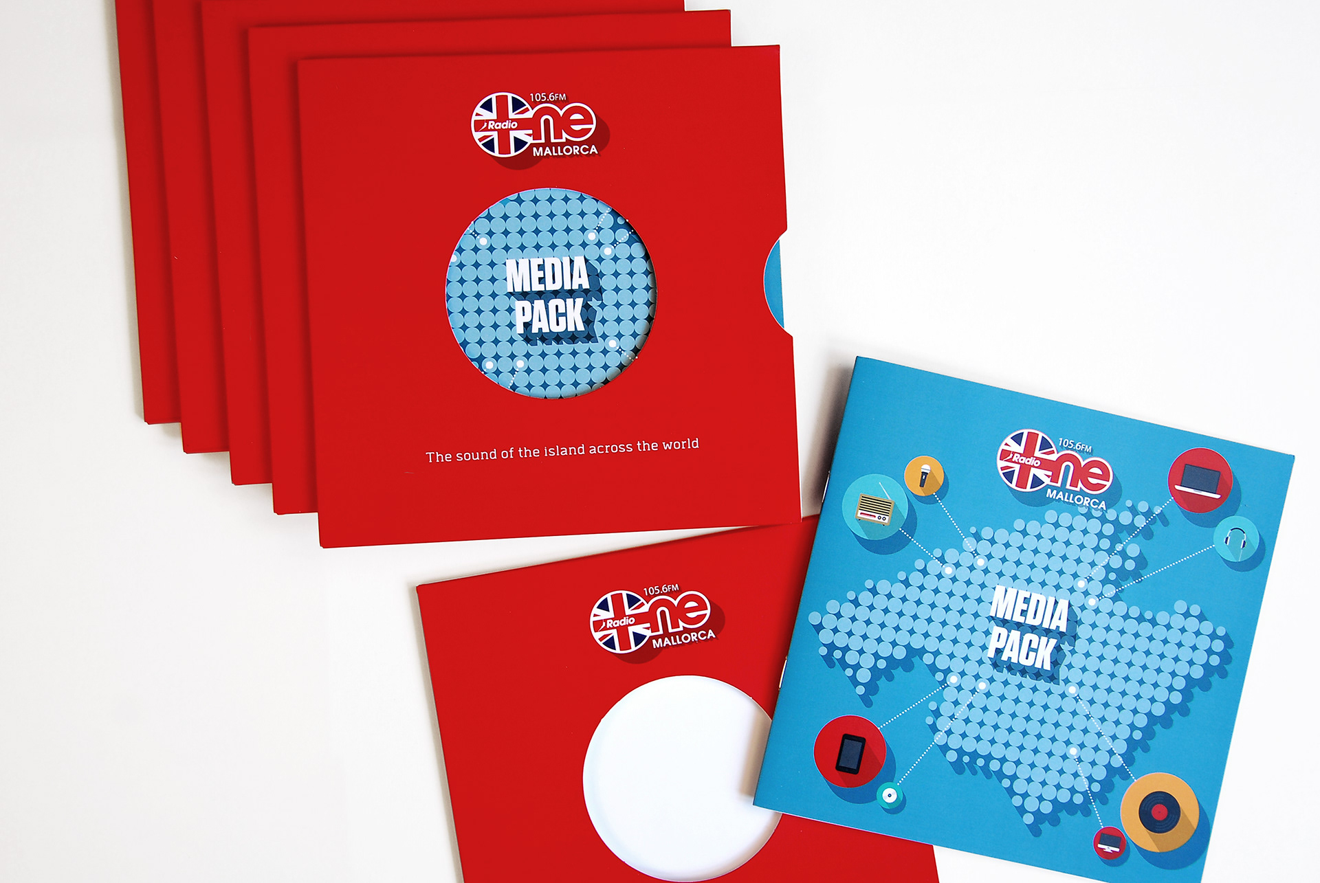
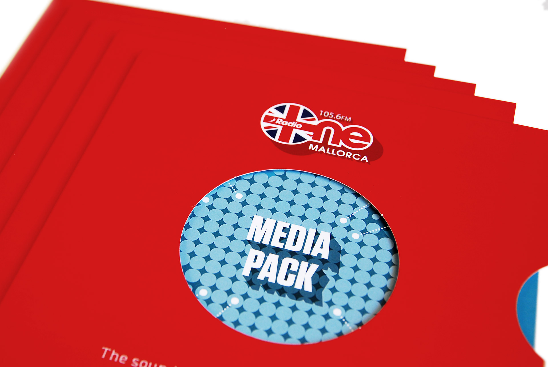
Because the station is all about the music, what better solution would be to design the pack as if it were a 7-inch single? It was kind of obvious… but not too obvious at the same time, and the client loved the idea.
So, the brochure was designed in a 175mm square format and the rate card and scheduling inserts designed as a bi-fold 2-pager, creating a long space for the daily/weekly schedule to be displayed in a timeline format, which folded down to the same size. The outer card folder replicated a 7-inch single cover, with a die-cut hole in its centre.
And it proved to be incredibly practical too. The sleeve was printed with just the station’s logo and strapline with the title of the media pack being visible through the aperture, printed on the font of the brochure itself. This meant that the sleeve could be used to house a range of inserts, and not just the media pack contents it was originally designed for.
Rock out
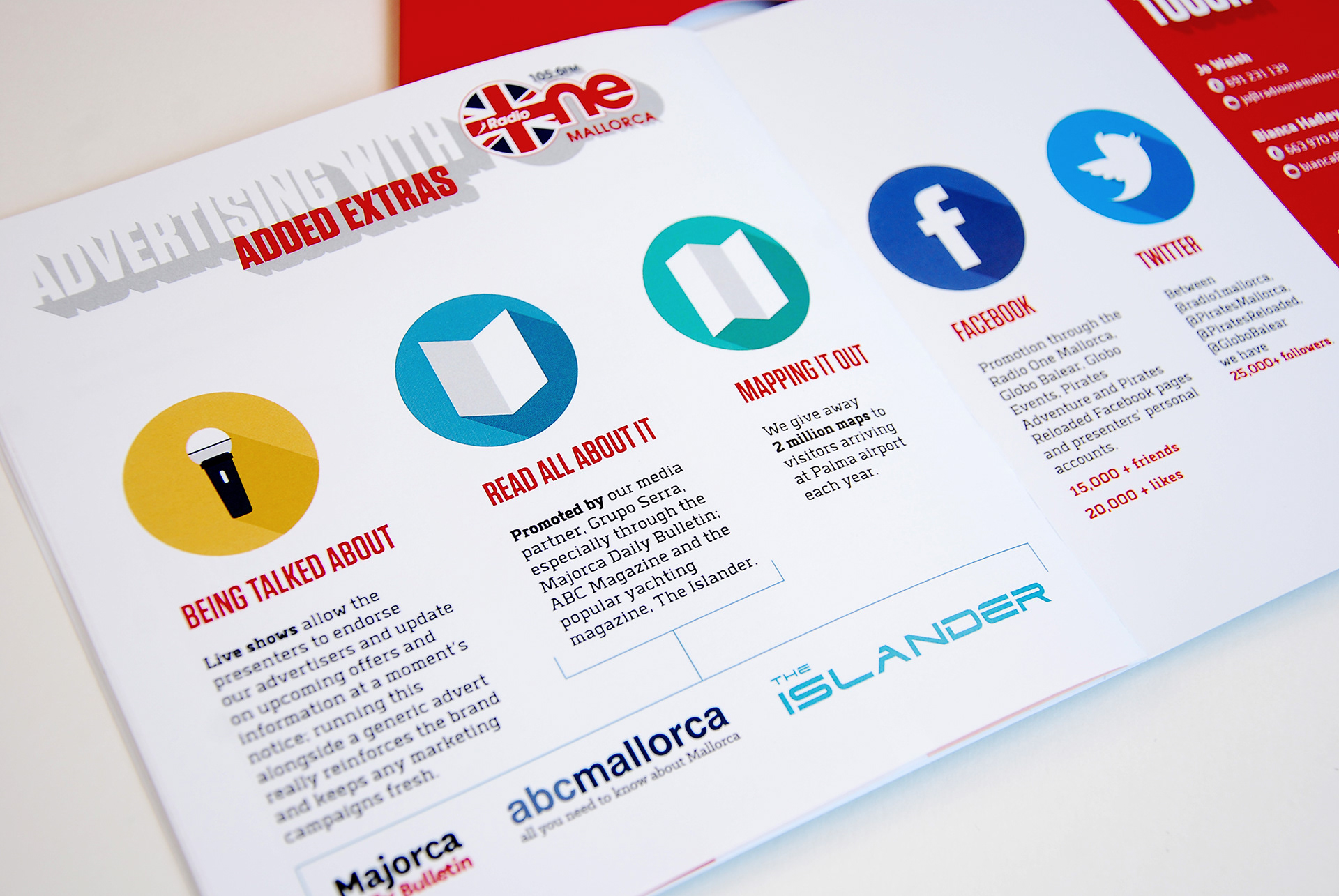
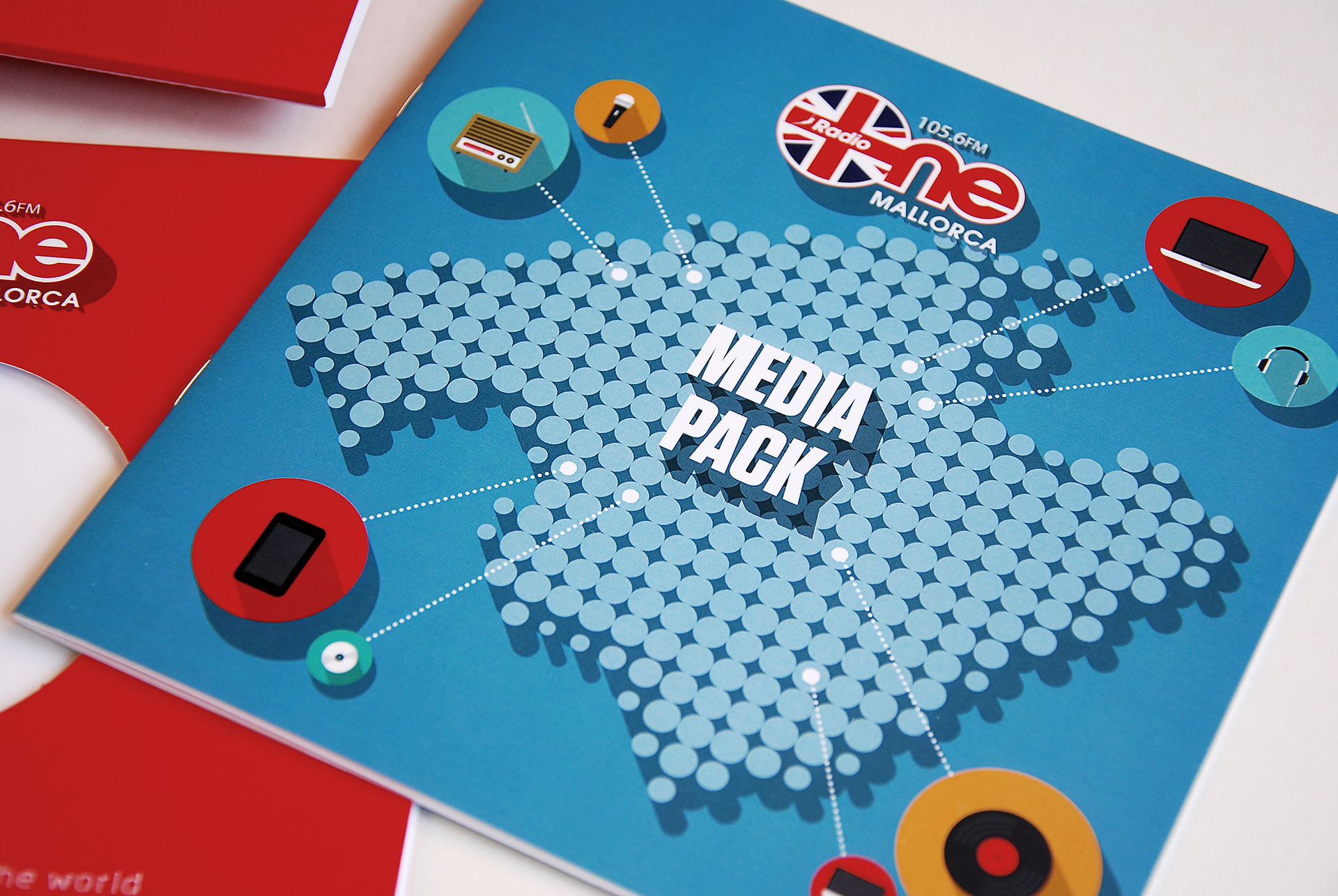
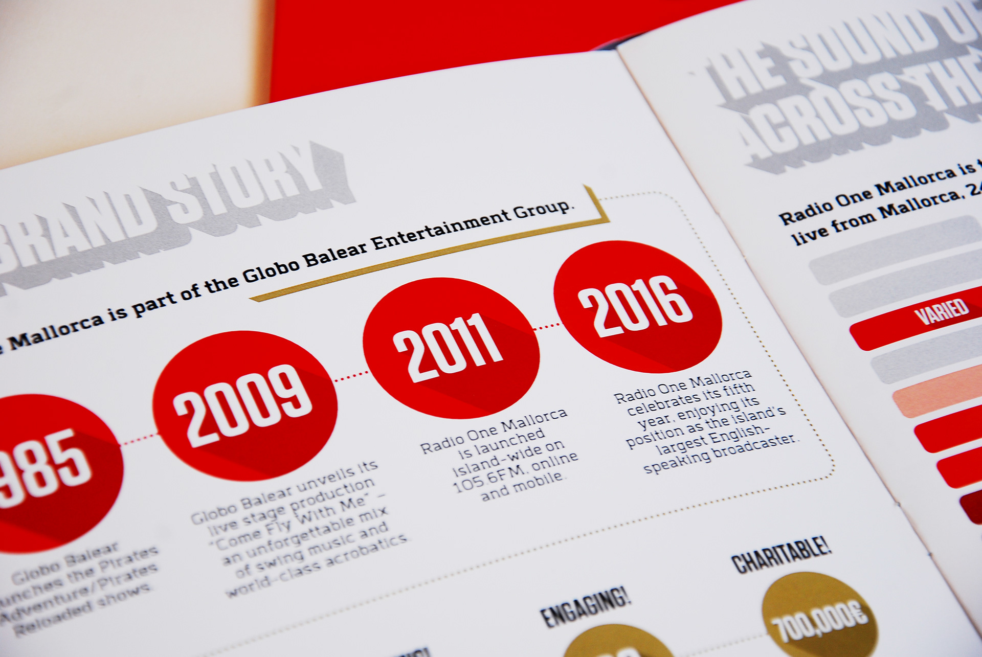
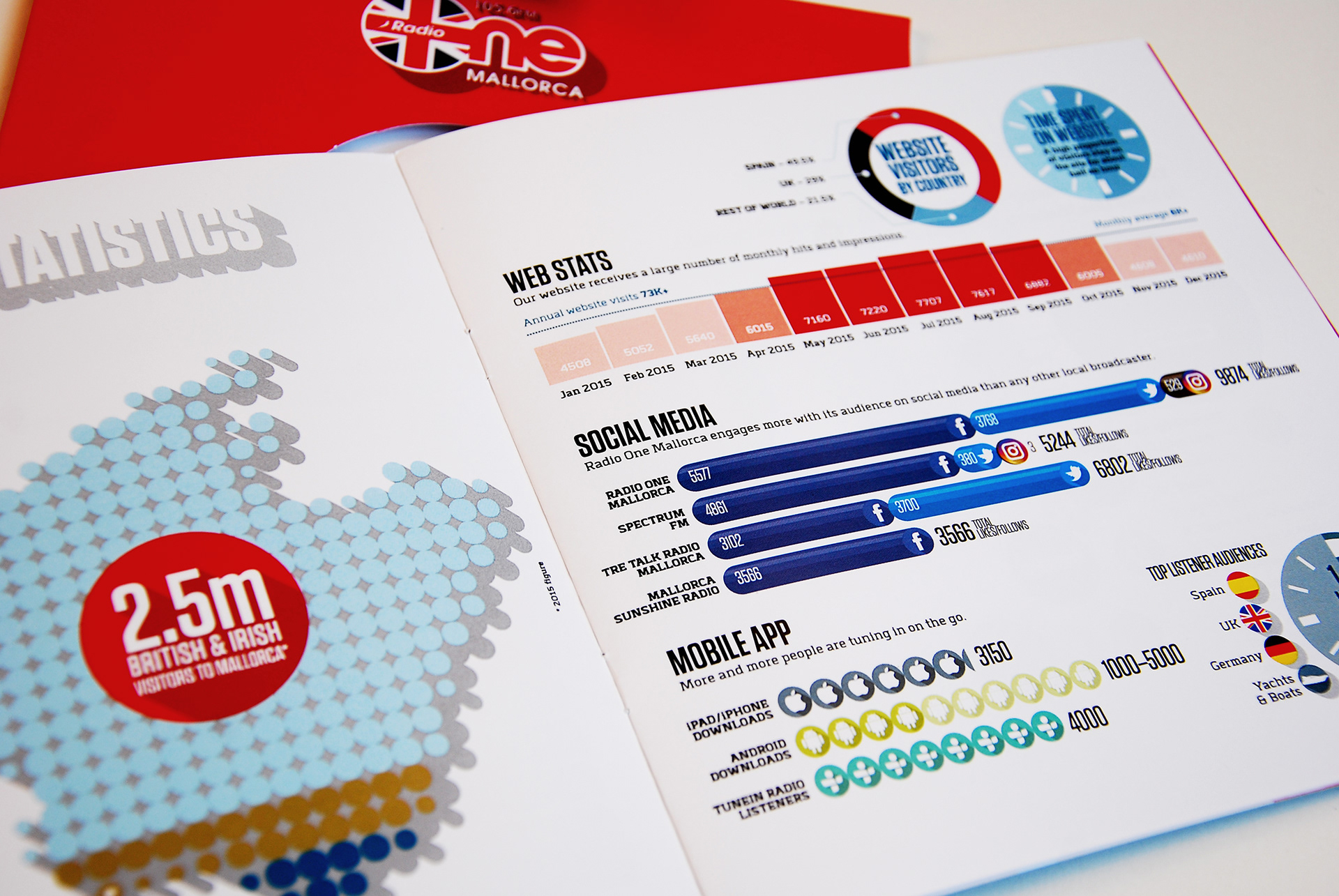
Graphics-wise, I obviously had to work with the station’s existing logo and identity, but the brief was to present the statistical data as far as possible in diagram or infographic form. So, the circular motif of the die-cut ‘record sleeve’ was followed through with circles being used throughout to form maps and the bias of most of the icons and illustrations, which were either created special or adapted from library sources. To provide a further layer of consistency to the graphic elements throughout, a representation of a 45 degree shadow was applied to logos, pictograms and headline text, making a subtle allusion to Mallorca’s rightful reputation as being one of the Mediterranean’s main sunshine isles.
Assets and graphics were then adapted and applied to the station’s website. Go on… give it a listen. The music sounds as good as this piece looks! www.radioonemallorca.com