Backstory
I go back a long way in my relationships with architects. Winding right back to 1988, I was recruited as a junior designer within the graphics department at Building Design Partnership in their head office in Preston, UK. Despite my relative lack of experience, I was thrown in at the deep end and tasked with working on branding, signing and wayfinding schemes for major projects including government departments, universities, shopping centres and town centre redevelopments.
This is a relationship that has come full circle and in the last few years as a freelancer, I regularly find myself in BPD's Manchester office working in support of the graphics unit and architects during periods of peak demand on some very prestigious projects.
In the beginning...
In the intervening years, I've worked successfully with a number of architectural practices in one capacity or another, but in the spring of 2020, I was delighted to get a phone call from a team, the core of which I'd worked with for getting on for 20 years. Circumstances had changed; they were setting up a new practice, mid-COVID pandemic and would I like to be involved in helping them getting their initial branding established and website set up? Well, of course I would!
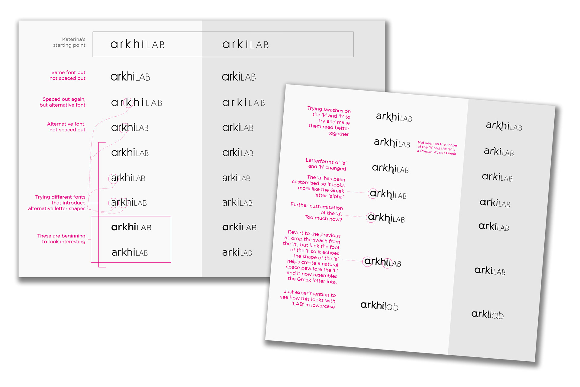
They had clearly given this some thought and were ready to hit the ground running. On account of one of the team being of Greek origin, they had hit upon the name 'arkhiLAB', derived from the original Greek etymology of the word 'architecture', the Latinised version of the Greek stem 'Arkhi-' meaning 'chief' or 'principal'. We initially played around with that as a logotype and as plain written text with different capitalisations – seeing how the letters worked together and whether a clear way of pronunciation was evident. It was soon felt that it wasn't, so we removed the 'h' so the name became 'ArkiLAB'.
If we had Anglicised this further to the standard 'Archi-' prefix we recognise in the word 'Architecture', we felt there would still be potential for mispronunciation of its written form, so we settled for 'Arkilab'. Whilst appearing a little unconventional, it certainly couldn't be pronounced in any other way, and it made for a unique URL for the new website.
Less is more
With visually economical, less-is-more philosophy in mind, I set about looking at what subtle stylings we could bring to the letterforms to produce a unique, but relevant logotype. The eye naturally falls on the 'a' – the first letter in the name, which was handy, because 'alpha' is the first letter of the Greek alphabet, and itself alludes to concepts of being 'the first', 'the leading', 'the principal'. The Greek character 'alpha' has a distinctive terminal at the foot of its stem, which was then applied to other characters – the 'i' which made it resemble the Greek character 'iota' and the 'l'. The choice of the alpha/a dictated that the whole word should be written in lower case, with a subtle shift in character weight between the two halves of the word to assist make the pronunciation completely unambiguous.

The arkilab team themselves, are great designers and had clear ideas on the simplicity they wished to apply to all their communications media. They provided great content and great imagery for their website, so this came together really quickly. We defined a limited colour pallet and chose elegant sans-serif typography to complement the logotype and worked up some simple icons to illustrate the sectors in which they work.
The website is based on an amalgamation of elements and effects hand-picked by the client in the uniquely constructed Wordpress site – which garnered some very appreciative comments from their contacts upon its launch.
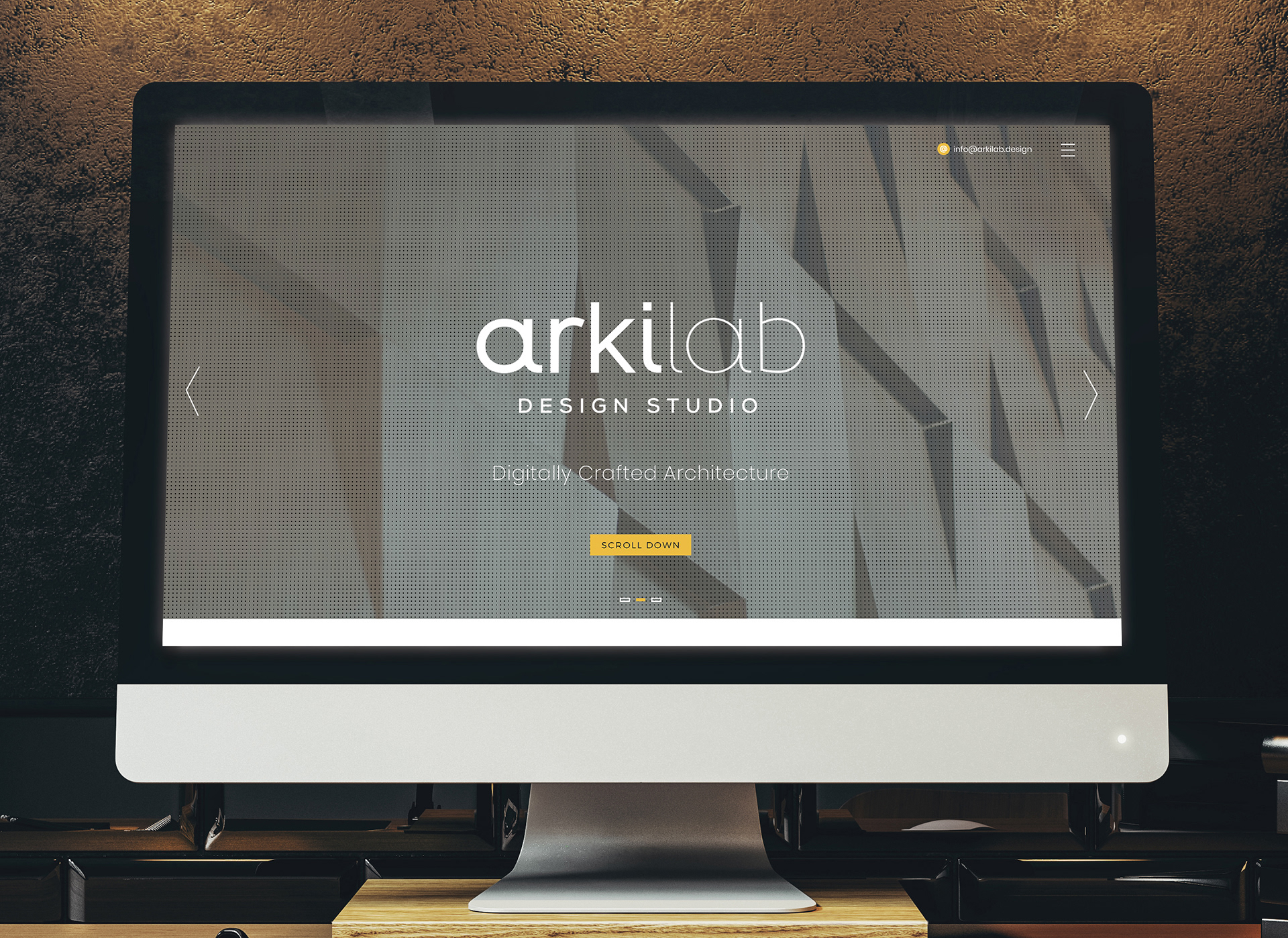

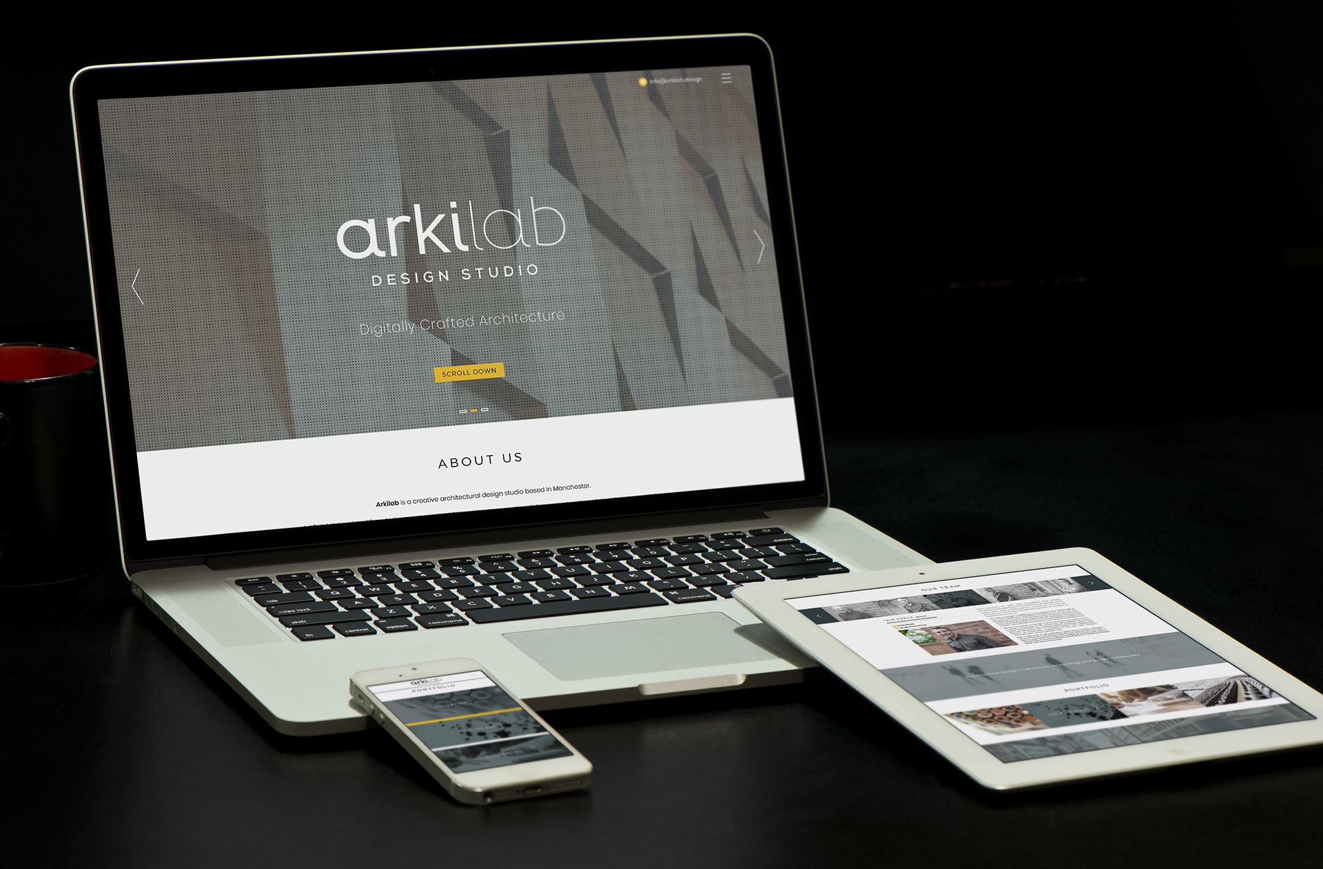
More detailed visuals of the website can be seen in the projects section here.
Or, of course, visit the arkilab website itself: www.arkilab.co.uk