Setting the scene
It’s not every day you get asked to design a movie poster. But that’s what happened.
A chance encounter with writer, director and the man behind Manchester-based Bee Movies, Karl Walsh at an art event in Stockport was the opening scene of this particular production.
He’d bought a couple of my illustrations and subsequently got back in touch saying he thought the style of my David Bowie artworks would suit the promotion of his next film, which was in the final stages of editing.
The main feature
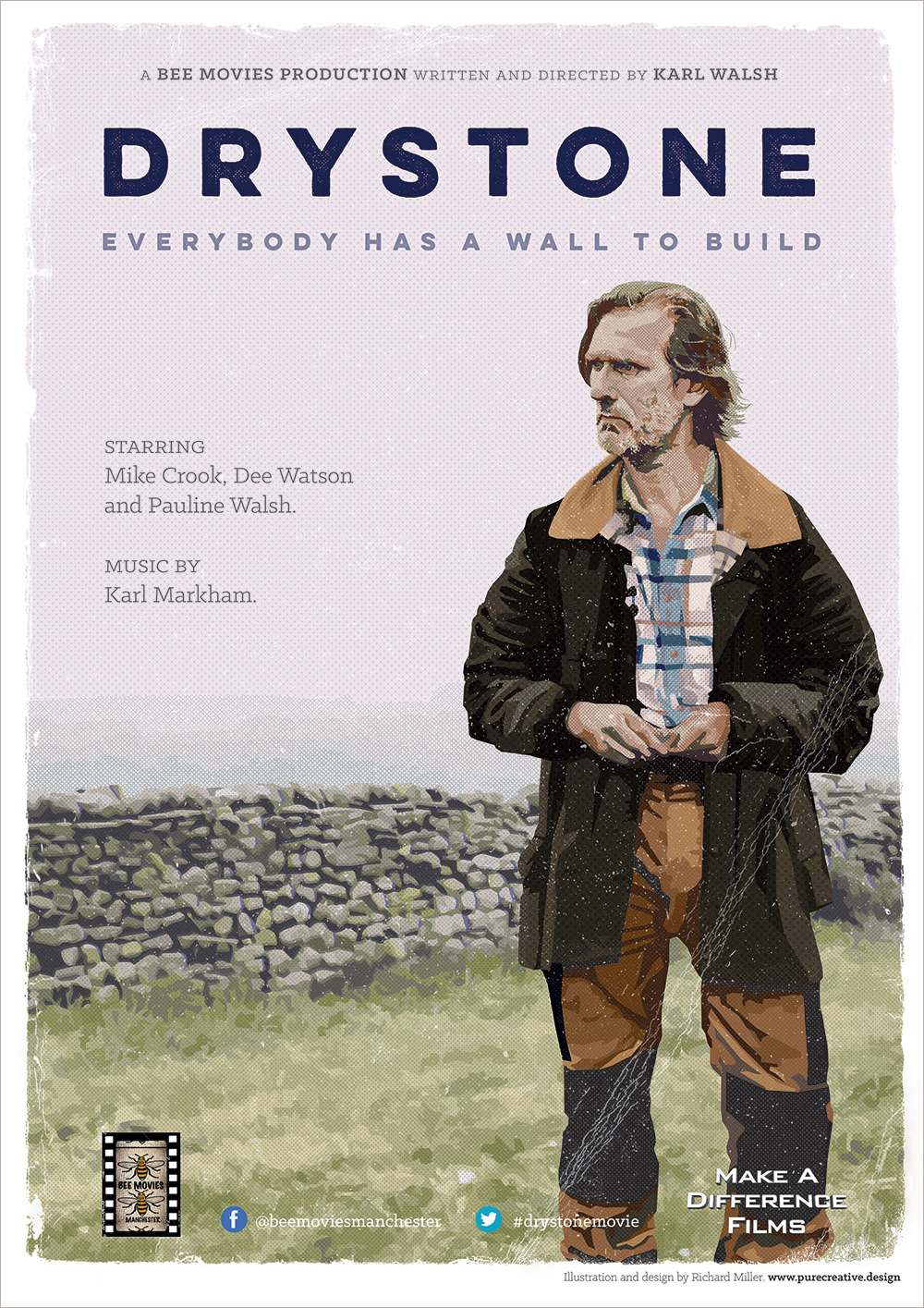
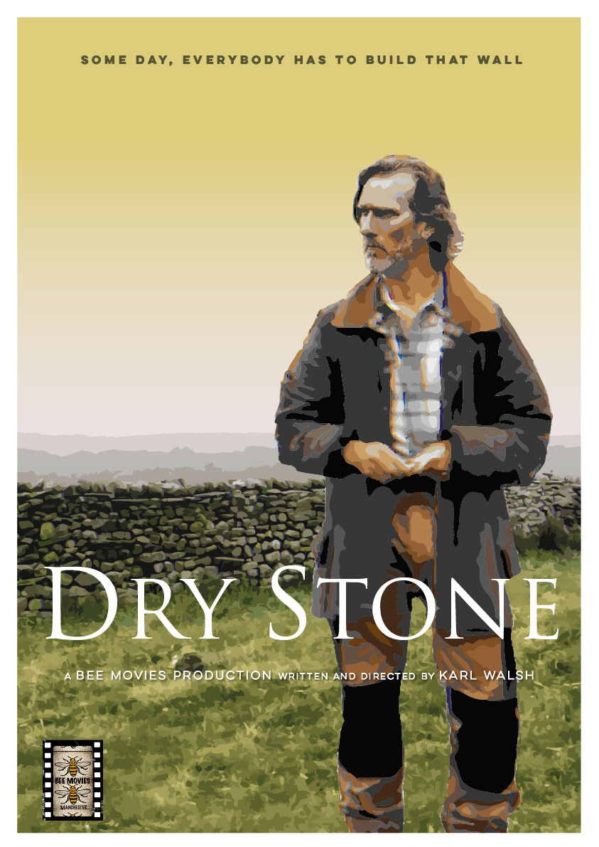
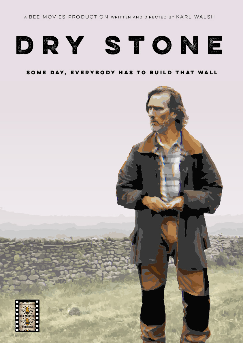
Drystone is a short movie telling the story of Frank (played by Mike Crook), a dry stone waller, battling his demons, coming to terms with having reached a crossroads in life whist in the process of completing a repair to a wall in the wilds of West Yorkshire.
The film is virtually a single-hander focusing on the character of Frank, so obviously, he had to go front-and-centre on the poster.
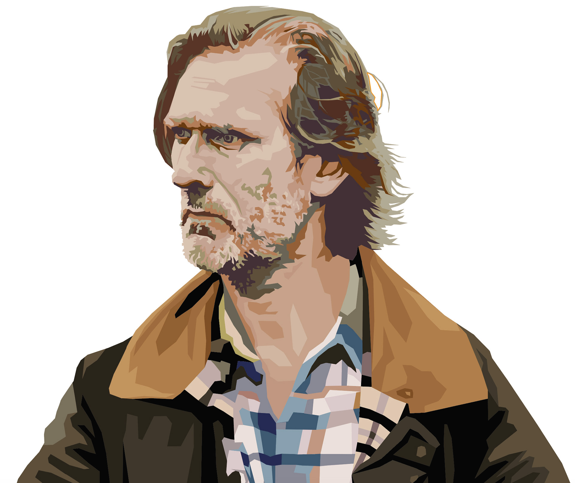
I was provided with a rough cut of the film, and viewed it several times over, taking note of the individual frames which were likely to make the best basis for an illustration.
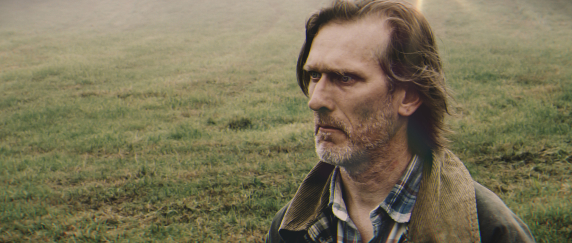
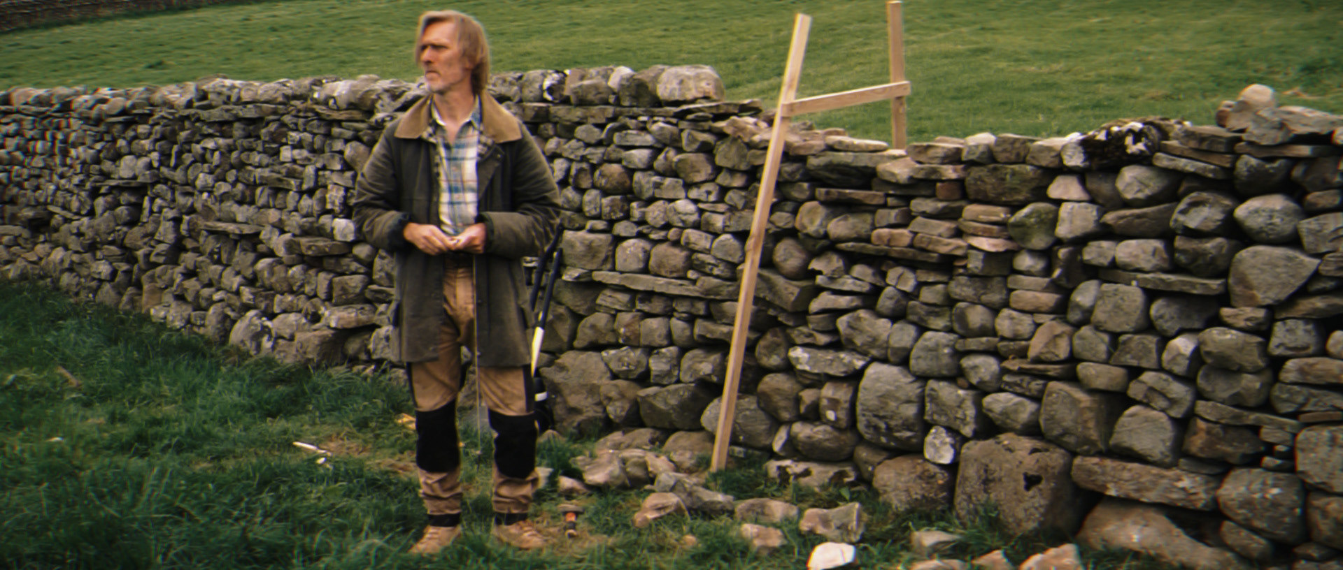
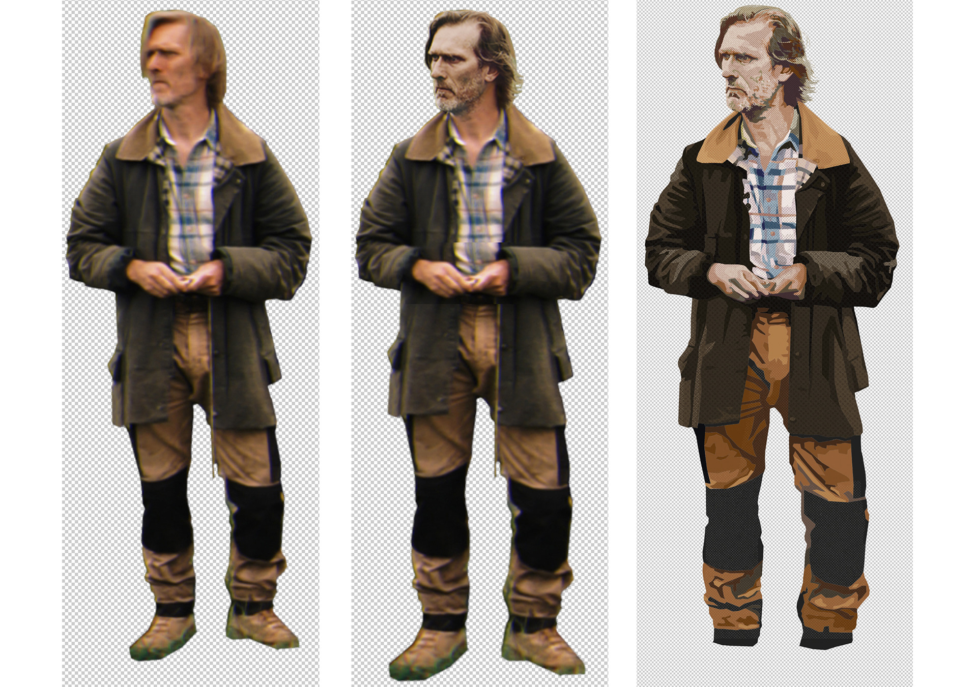
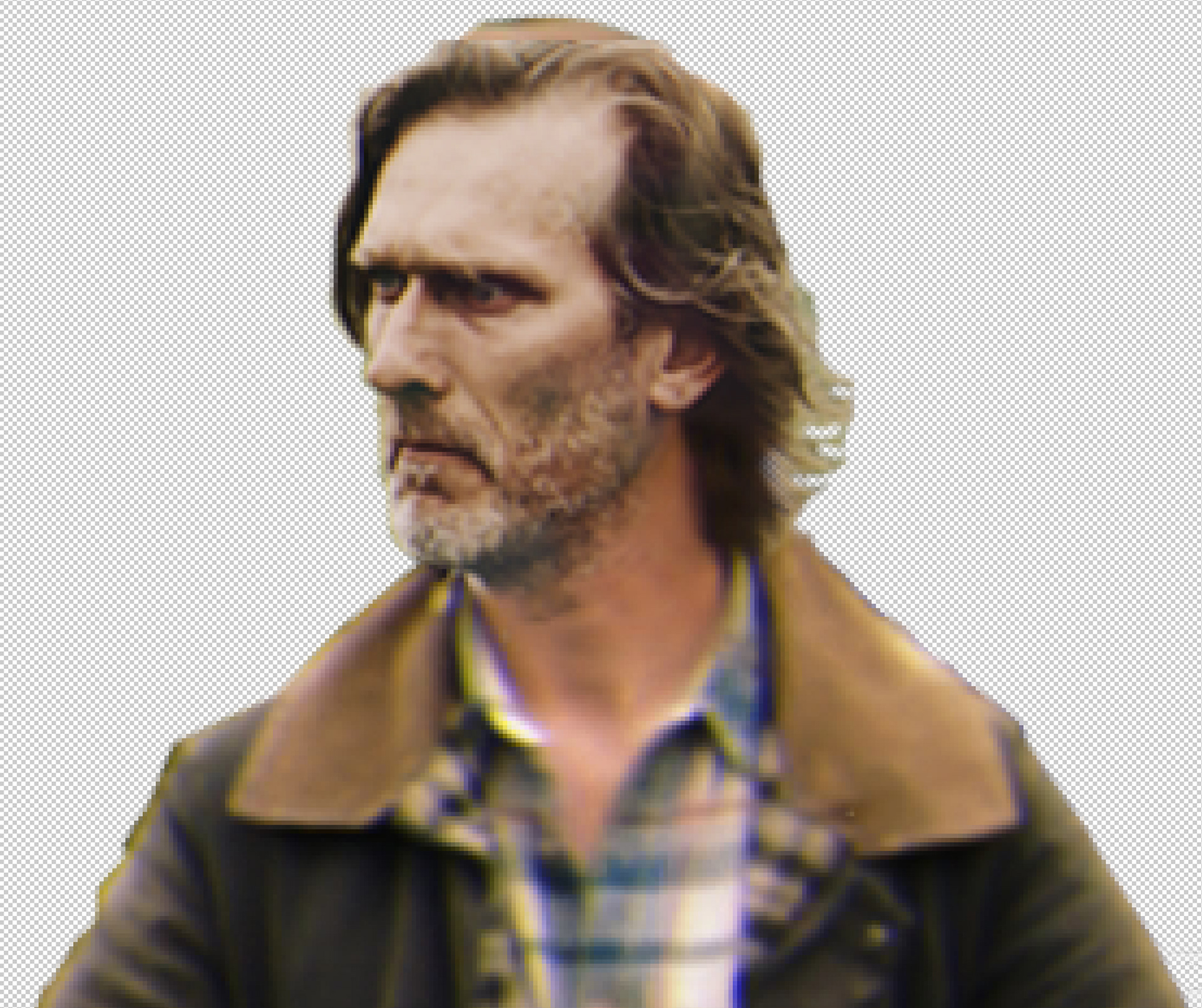
Of course, there wasn’t the perfect frame which captured Frank in the perfect pose with just the right expression on his face. So I created a comp in Adobe Photoshop, using the body from a long shot and the head from a close-up. The proportions of each were then adjusted even further so the character had the right presence, pose and contemplative expression for the poster.
Plot twist
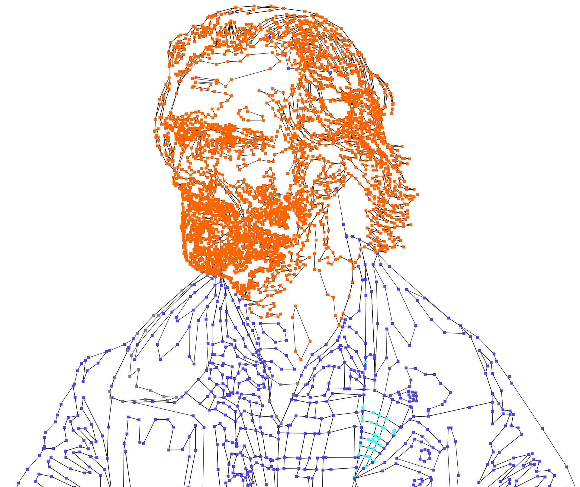
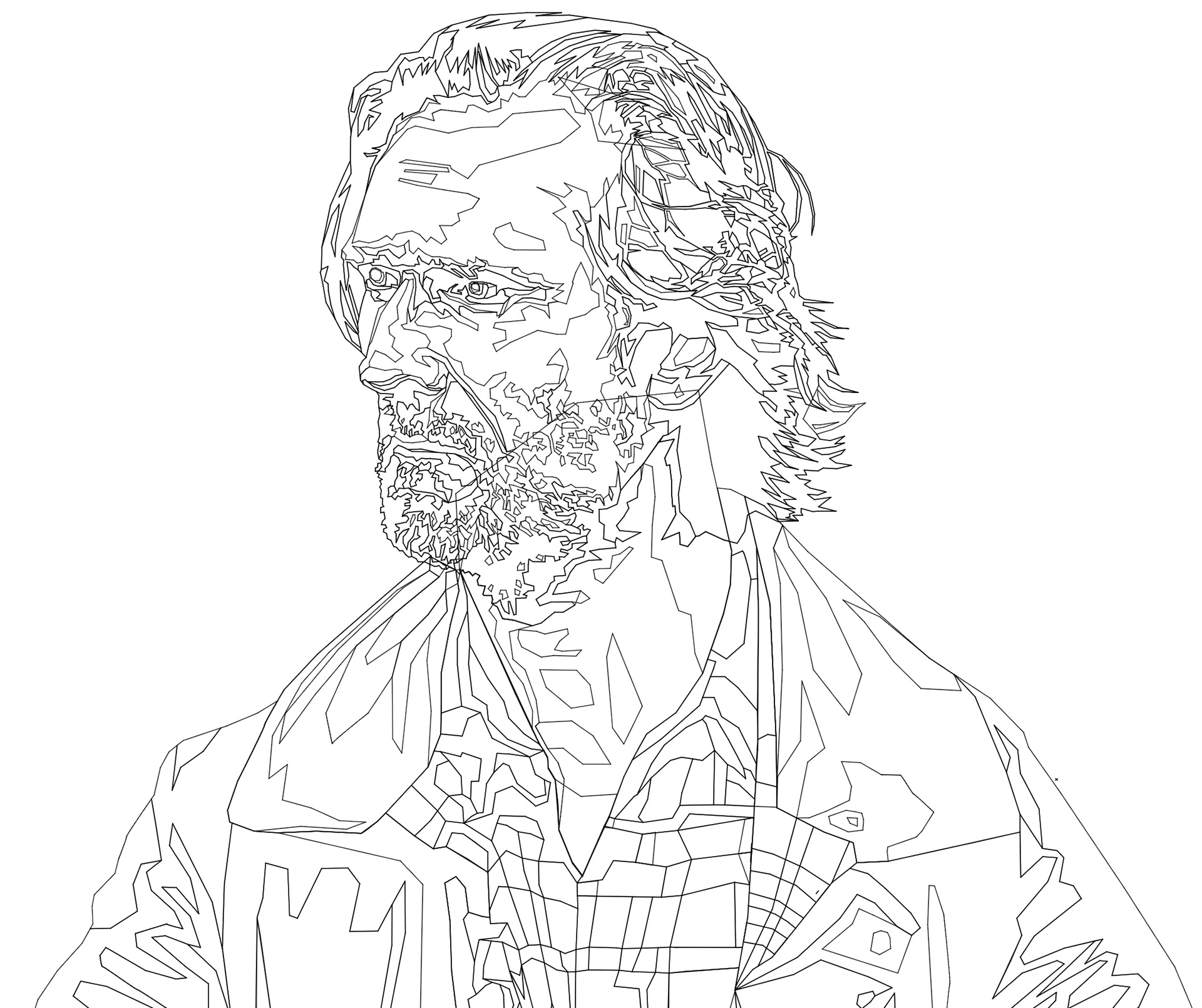
The particular style of illustration that had caught the director’s eye necessitated bringing the comp into Adobe Illustrator and recreating a ‘posterised’ digital drawing of the low quality bitmap image I’d created. Yes, there are commands in Photoshop and Illustrator that can do this automatically, but my way of individually plotting all the points to create shapes, which define the areas of colour tones provides much more control, involves more craftsmanship ensuring all the shapes fit together to create unique and cohesive end result – not unlike Frank finding the individual shapes of rock to construct his wall.
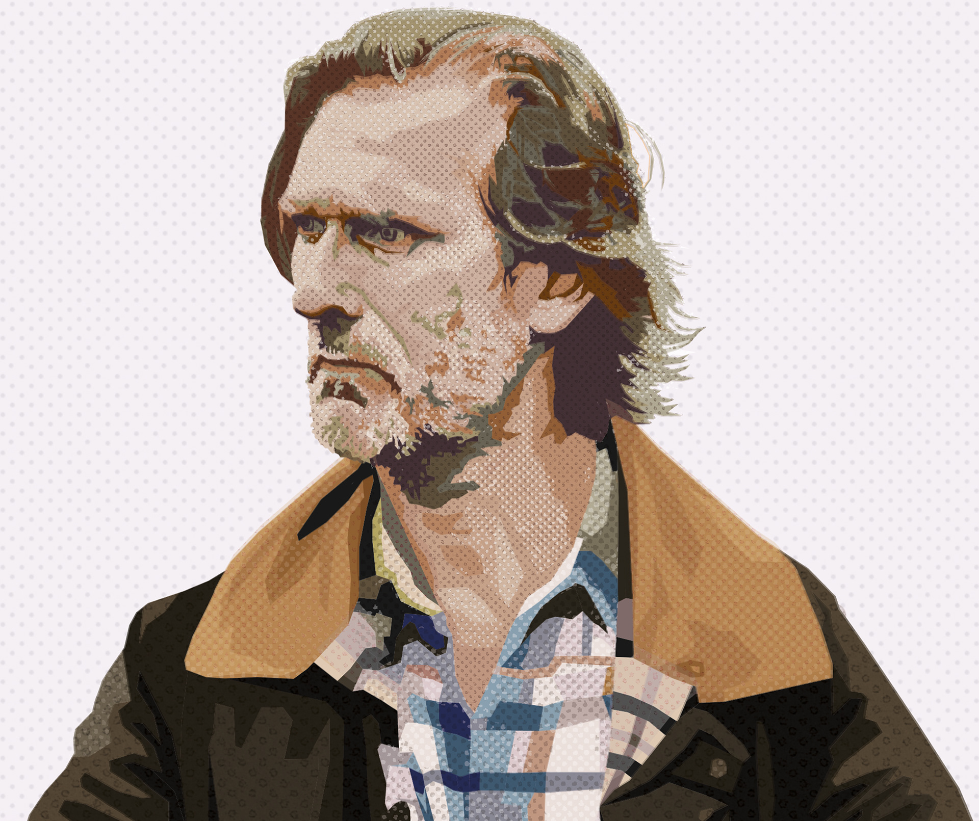
I then created limited colour palette, sampling tones from the film stills themselves and played about with them until I’d got a satisfactory representation of the character. This was then brought back into Photoshop, where different dot patterns and textures were added to make the image softer and more subtle and to provide a simulation of halftone printing effects.
A similar process was done using a still for the background, depicting Frank’s wall and the moorland setting, but auto-trace was used for this!
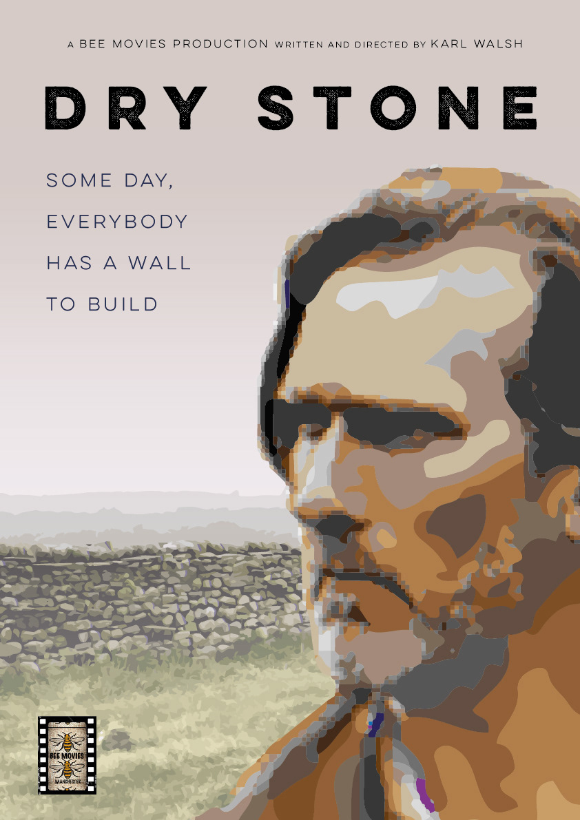
A number of different layouts and typographic treatments were considered before the final composition was chosen. The name of the film was subtly changed at the final design stage, when the word ‘Drystone’ was set without the word space and the director liked the idea… creating a metaphorical description of Frank himself.

End credits
The film was submitted to and shown at a number of international film festivals throughout 2021 and the poster even found its was onto the awards shortlist at one of them!
The next Bee Movies production is well underway. Just waiting for the call to get cracking ion the poster!
Watch the trailer for Drystone here.