
...We'll throw it on the fire and take the car downtown.
It’s not normally good form to criticise the work of another designer, but sometimes a bit of straight talking needs to be done.
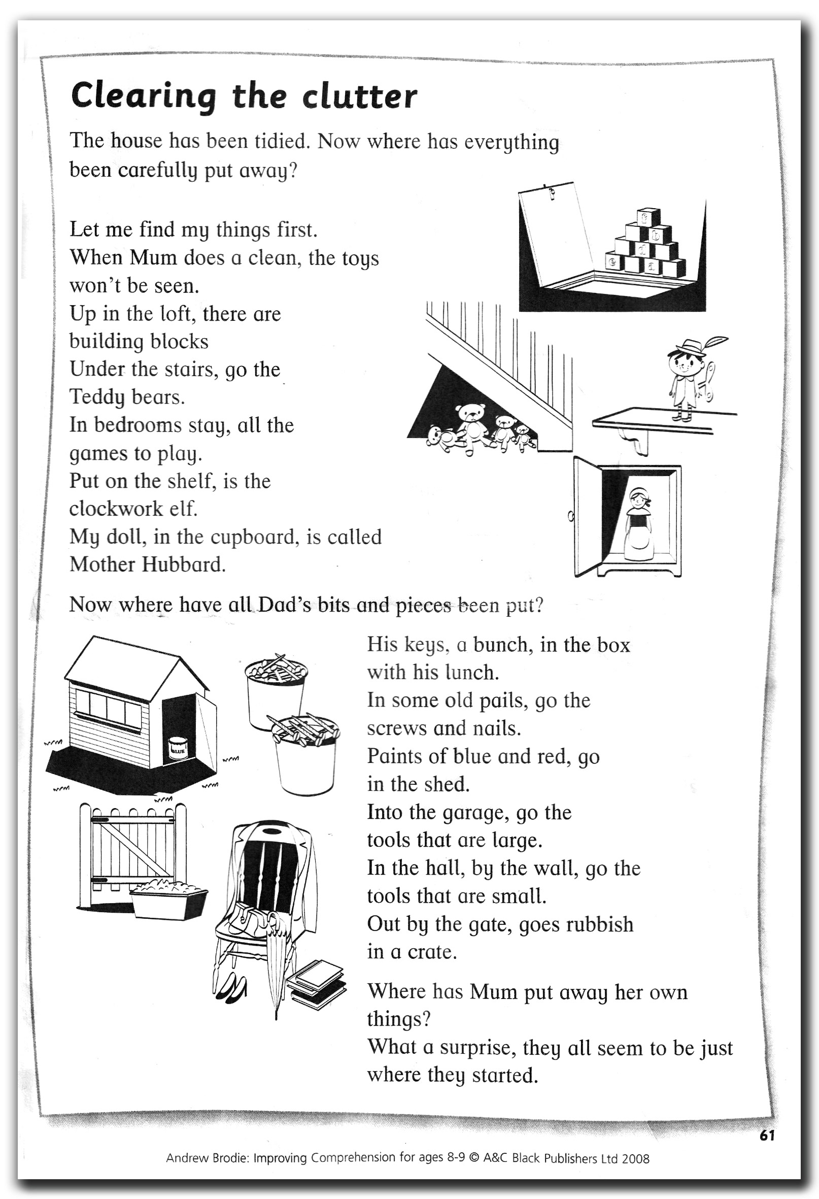
This isn’t a high concept piece under the spotlight, here; just a common or garden sheet of black and white photocopied comprehension homework my son brought from school.
Here it is in the first picture. Not spectacular. Not beautiful. All it needs to be is functional, so that the Year 3 class teacher can photocopy it, hand it out to their pupils who can read it, hopefully understand it and answer a few simple questions about it.
Tripping up
We’re not going to get into a critique of the poem itself; its idiosyncratic approach to verse structure and rhyming system. Nor its subject matter and the potential debates to be had about gender stereotypes contained therein.
No… this is about user interface design. If you haven’t done so already, please read the poem.
How did you get on…? Did you go from start to finish in one straight flow? Or did you keep tripping up and having to go back and re-read the odd line? Or maybe a whole verse? Or maybe you went right back to the beginning and started the whole thing over again. I know I did. A couple of times before I could get a clear idea of what was going on.
So, onto the comprehension. The first question asked of the reader was: “What is the purpose of the three questions being asked in the poem?” Three questions? I’m pretty sure there were only two. Let’s have another look. Ah yes… there it is. I’d missed it… hiding in plan sight! Twice! In this situation, you know you’re looking for a question mark, so your eye scans the text for them. I’d got the one half way down, and the one on the penultimate line, but I’d completely missed the one at the top, at the end of that first bit of text nestling under the title. And so had my son. And so did his mum when she looked at it. Why? Because for some reason, whoever laid this text out had put more less spacing between the tile and the first line of the poem, than between the first line and the rest of the first verse. So we'd all read it as part of the introduction to the piece; a line of explanation about the work in hand, which isn’t untypical of such homework. It looked to all three of us like the poem actually began on the line “Let me find my things first” and we’d discounted that first bit.
Bumpy ride
And it continues to be a very bumpy ride thereafter. I’m no grammatical expert, but to me, there are far too many unnecessary commas in some of the subsequent lines. The ones which are correct serve to break already short lines up into even shorter clauses, but whoever has typeset this has prioritised shoe-horning the banal clip-art illustrations in with no regard to the impact that’s going to have on where the lines of text break, which, when compounded with the commas really puts the concept of an easy read out of reach. If the lines have to be that length, then why not force a line break after a comma where possible? You can do this on any text layout software!
So, rather than this being a relatively simple piece of comprehension homework for an 8-year-old, it becomes something of an assault course for the eyes, with the comprehension aspect being significantly impacted upon by thoughtless design.
Taking all the same ingredients, it would have taken no longer to lay it out in a way that presents this work so it can at least be read more easily, thus giving the reader a better chance of understanding it.
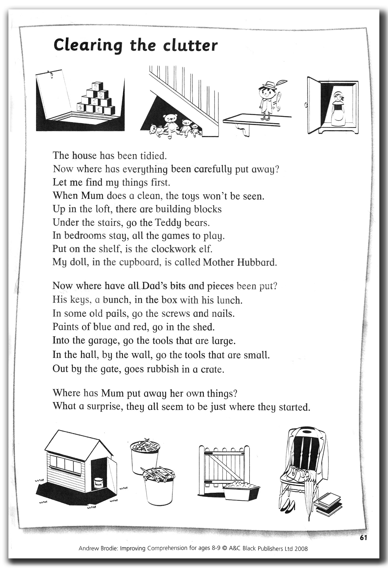
Here’s my go at laying it out… banal clip art illustrations included!
Must try harder
Is it better? I hope you agree that it is. I’m a designer. I take pride in producing layouts that are clear and logical, however complex or simplistic the piece. But then again, presumably a designer laid it out in the published version. And with it being a published version, presumably it was checked by someone else. And thereafter, it possibly went via an editor before it was signed off to be printed. Why did anyone let it get released like that?
A&C Black Publishers is owned, these days at least, by Bloomsbury Press, not some tuppenny-ha’penny publishers. They have published an educational resource with the sole purpose of being an aid to reading and understanding for young Key Stage 2 kids.
The whole point of a piece of written communication like this is that it is accessible and can communicate. As designers, we have a responsibility to make this happen. Not all 8-year-olds are fantastic readers. Some will have dyslexia and other conditions that will impact in their ability to read and understand what they are intended to. I’ll give the designer 1 out of 10 and a “Must try harder”.
Back to blog | < Previous story | Next Story >